Responsive design adjusts fluidly to any screen size using flexible grids and media queries, while adaptive design serves fixed layouts for specific device breakpoints. If you're building a modern website, responsive design is almost always the better choice—it's more cost-effective, easier to maintain, and provides better SEO performance across all devices.
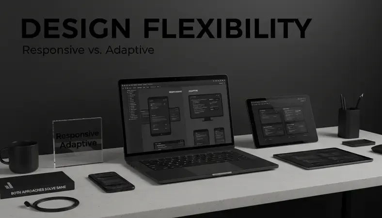
Both approaches solve the same core problem: making websites work across desktop computers, tablets, and smartphones. But they take fundamentally different paths to get there. Understanding which approach fits your project can save you thousands in development costs and months of maintenance headaches.
What Is Responsive Design?
Responsive design is a web development approach that creates websites using flexible grids, images, and CSS media queries to automatically adapt content to any screen size. Think of it like water taking the shape of whatever container you pour it into—the content flows and reshapes itself seamlessly.
The magic happens through three core technologies working together:
- Fluid Grids: Layout elements resize proportionally rather than using fixed pixel widths
- Flexible Images: Photos and graphics scale up or down based on screen dimensions
- Media Queries: CSS rules that apply different styles based on device characteristics
When someone visits a responsive website, their browser automatically serves the most appropriate layout for their screen. A navigation menu might collapse into a hamburger icon on mobile, while staying fully expanded on desktop. Text reflows naturally, and images resize proportionally.
Key Insight: Responsive design uses one codebase that works everywhere, making it significantly easier to maintain than multiple separate versions.
How Does Responsive Design Work?
Responsive design relies on percentage-based layouts and CSS breakpoints to create fluid experiences. Instead of designing for specific devices, developers create flexible systems that work across the entire spectrum of screen sizes.
Here's what happens behind the scenes:
Flexible Grid System: The layout uses percentages instead of fixed pixels. A sidebar might be 25% of screen width rather than exactly 300 pixels wide.
CSS Media Queries: These detect screen characteristics and apply appropriate styles. For example:
css
@media (max-width: 768px) {
.sidebar { display: none; }
}
Scalable Images: Images use max-width: 100% to prevent overflow while maintaining aspect ratios.
The browser does all the heavy lifting. When someone rotates their tablet or resizes their browser window, the layout automatically adjusts in real-time without requiring a page reload.
What Is Adaptive Design?
Adaptive design creates multiple fixed-width layouts for specific device categories, then detects the user's device and serves the most appropriate version. Think of it as having separate outfits for different occasions rather than one versatile outfit that works everywhere.
Instead of one flexible layout, adaptive design typically creates distinct versions for:
- Desktop: Usually 1024px or wider
- Tablet: Often 768px to 1023px
- Mobile: Typically 320px to 767px
When someone visits an adaptive website, server-side detection identifies their device and delivers the corresponding layout. Each version is crafted specifically for its target screen size, potentially offering more precise control over the user experience.
The trade-off is complexity. Adaptive design requires maintaining multiple codebases, testing across different versions, and ensuring content parity between layouts.
Responsive Design vs Adaptive Design

Comparison of Design Approaches
| Aspect | Responsive Design | Adaptive Design |
|---|---|---|
| Development Cost | Lower – one codebase | Higher – multiple layouts |
| Maintenance | Easier – single version | Complex – multiple versions |
| Loading Speed | Faster initial load | Potentially slower detection |
| SEO Performance | Better – one URL structure | Can be problematic with multiple URLs |
| Device Coverage | Covers all screen sizes | Limited to defined breakpoints |
| Design Control | Less precise control | More precise per-device control |
The fundamental difference lies in philosophy. Responsive design embraces flexibility and unknowns—it prepares for devices that don't exist yet. Adaptive design prioritizes control and optimization for known device categories.
When to Choose Responsive Design
Responsive design works best for:
- Content-heavy websites where information needs to flow naturally across devices
- Budget-conscious projects requiring cost-effective development and maintenance
- SEO-focused sites that benefit from single URL structures
- Future-proofing against new device sizes and orientations
- Teams with limited resources for maintaining multiple codebases
Most modern websites choose responsive design because it solves the core problem efficiently while keeping complexity manageable.
When to Choose Adaptive Design
Adaptive design makes sense for:
- Complex web applications requiring dramatically different interfaces per device
- Performance-critical sites where every millisecond matters
- Highly interactive experiences that need device-specific optimizations
- Large enterprise projects with resources for maintaining multiple versions
- Specialized use cases where responsive constraints limit functionality
Why Is Responsive Design Important?
The mobile internet revolution makes responsive design essential rather than optional. Over 60% of web traffic now comes from mobile devices, and Google uses mobile-first indexing for search rankings.
Here's why responsive design matters:
Search engine benefits: Google explicitly recommends responsive design and may penalize sites that aren't mobile-friendly. Having one URL per piece of content (instead of separate mobile URLs) consolidates your SEO authority.
Cost efficiency: Building and maintaining one responsive site costs significantly less than creating separate desktop and mobile versions. You're essentially getting multiple websites for the price of one.
User expectations: Modern users expect websites to work seamlessly across their devices. A poor mobile experience drives visitors away—often permanently.
Future-Proofing: New devices with unique screen sizes launch constantly. Responsive design automatically accommodates these without requiring updates.
Bottom Line: Responsive design isn't just about mobile phones anymore. It's about creating experiences that work on smartwatches, tablets, large desktop monitors, and devices that haven't been invented yet.
Best Practices for Responsive Web Design
Successful responsive design requires strategic planning and attention to key principles:
Mobile-First Approach
Start designing for the smallest screen first, then progressively enhance for larger devices. This approach forces you to prioritize essential content and functionality.
- Benefits: Faster mobile loading, cleaner code structure, better performance
- Implementation: Write base CSS for mobile, then use min-width media queries for larger screens
- Content Priority: Essential information appears first, supplementary content loads as space allows
Performance Optimization
Responsive sites must load quickly across all devices, especially on slower mobile connections:
- Image Optimization: Use responsive images with srcset attributes to serve appropriate sizes
- CSS Efficiency: Minimize media query complexity and avoid redundant styles
- JavaScript Loading: Defer non-critical scripts and use conditional loading for device-specific features
- Font Loading: Implement web font loading strategies that don't block rendering
Testing Across Devices
Responsive design requires extensive testing beyond just resizing your browser window:
- Real Device Testing: Use actual phones and tablets, not just browser developer tools
- Cross-Browser Compatibility: Test on Safari, Chrome, Firefox, and Edge across different operating systems
- Network Conditions: Simulate slower connections to ensure acceptable performance
- Orientation Changes: Verify layouts work in both portrait and landscape modes

Responsive Design Tools and Frameworks
The right tools can dramatically speed up responsive development while ensuring consistency and best practices.
CSS Frameworks
Bootstrap: The most popular responsive framework, providing a comprehensive grid system and pre-built components. Best for rapid prototyping and teams needing consistent design patterns.
Foundation: A more flexible alternative to Bootstrap with advanced responsive features. Ideal for custom designs requiring fine-grained control.
Tailwind CSS: A utility-first framework that provides responsive classes without imposing design decisions. Perfect for developers who want maximum customization.
Development Tools
Browser developer tools: Chrome, Firefox, and Safari all include responsive design modes for testing different screen sizes during development.
Responsive design checkers: Online tools that show how your site appears across multiple device sizes simultaneously.
Performance testing tools: Google PageSpeed Insights and GTmetrix help identify responsive design performance issues.
Design Software
Figma: Collaborative design tool with excellent responsive design features and developer handoff capabilities.
Adobe XD: Comprehensive design platform with responsive resize features and prototyping tools.
Sketch: Popular among web designers for creating responsive mockups and design systems.
Mobile-First vs Desktop-First Approach
The order in which you approach responsive design significantly impacts both development efficiency and final performance.
Mobile-First Development
Mobile-first means writing your base CSS for smartphones, then using media queries to enhance the experience for larger screens:
/* Base styles for mobile */
.container { width: 100%; }
/* Enhance for tablets */
@media (min-width: 768px) {
.container { width: 750px; }
}
/* Enhance for desktop */
@media (min-width: 1200px) {
.container { width: 1170px; }
}
Advantages: * Faster mobile performance (no unnecessary CSS) * Forces content prioritization * Progressive enhancement mindset * Better alignment with mobile-first indexing
Desktop-First Development
Desktop-first starts with full desktop layouts, then uses media queries to adapt for smaller screens:
/* Base styles for desktop */
.container { width: 1170px; }
/* Adapt for tablets */
@media (max-width: 1199px) {
.container { width: 750px; }
}
/* Adapt for mobile */
@media (max-width: 767px) {
.container { width: 100%; }
}
Disadvantages: * Mobile devices load unnecessary desktop CSS * Tends to result in "feature removal" rather than thoughtful mobile design * Can lead to performance issues on slower connections
Most web development experts now recommend mobile-first as the default approach, especially for content-focused websites where mobile traffic dominates.

Common Questions About Responsive Design
Is responsive design still relevant in 2024?
Absolutely. Responsive design has become more important, not less. With the proliferation of device types—from smartwatches to ultra-wide monitors—having flexible layouts is essential. Google's continued emphasis on mobile-first indexing makes responsive design a requirement for SEO success.
How does responsive design affect website speed?
When implemented correctly, responsive design can actually improve website speed by eliminating redirects and serving optimized content for each device. However, poorly implemented responsive sites that load unnecessary resources can be slower than well-optimized adaptive sites.
Can I convert my existing website to responsive design?
Yes, but the complexity depends on your current site structure. Simple websites with clean HTML can often be converted by updating CSS and adding media queries. Complex sites with table-based layouts or heavy Flash content may require complete rebuilds.
What's the difference between responsive and mobile-friendly?
Mobile-friendly means your site works on mobile devices but might use separate mobile URLs (like m.yoursite.com). Responsive design uses the same URL and HTML for all devices, with CSS controlling the layout changes. Google prefers responsive design over separate mobile sites.
Do I need different images for responsive design?
Modern responsive design uses techniques like responsive images (srcset attribute) to serve appropriate image sizes for different devices. This ensures fast loading on mobile while maintaining quality on high-resolution displays.
How do I test if my website is truly responsive?
Use browser developer tools to simulate different screen sizes, test on actual devices, and use Google's Mobile-Friendly Test. Pay attention to text readability, button sizes, and horizontal scrolling—none of these should be problematic on any device.
Conclusion
Responsive design wins for most projects because it's cost-effective, SEO-friendly, and future-proof. Unless you're building a complex application requiring device-specific interfaces, responsive design provides the best balance of functionality, maintainability, and user experience.
Explore responsive WordPress themes at Dope Theme — professionally designed templates that automatically adapt to any screen size without requiring custom development. Ready to get started? Visit Dope Theme to learn more.