Creating a compelling Google Slides background doesn't require advanced design skills or expensive software. Whether you're building client presentations for your web design agency, crafting pitch decks as a freelancer, or developing branded templates for your digital agency, the right background can transform an ordinary slideshow into a professional masterpiece. The key lies in understanding how Google Slides handles backgrounds and knowing which techniques actually work in real-world scenarios.
A well-designed Google Slides background serves as the foundation for your entire presentation. It sets the tone, reinforces your brand, and keeps your audience engaged without overwhelming your content. Modern presentation design trends favor clean, purposeful backgrounds that enhance readability while maintaining visual interest. You'll discover how to create custom backgrounds, implement brand-consistent designs, and avoid the common pitfalls that make presentations look amateurish.

Understanding Google Slides Background Fundamentals
Google Slides background customization operates on a layered system that many users don't fully grasp. Unlike static image editors, Google Slides treats backgrounds as dynamic elements that can be modified, replaced, or enhanced across individual slides or entire presentations. This flexibility makes it an ideal platform for agencies and freelancers who need to maintain brand consistency while adapting to different client requirements.
The platform supports multiple background types, each serving different presentation needs. Solid color backgrounds provide clean, distraction-free canvases perfect for text-heavy slides or minimalist designs. Gradient backgrounds add subtle visual interest without overwhelming content, making them popular for corporate presentations. Image backgrounds offer the most creative flexibility but require careful consideration of text readability and brand alignment.
Why It Matters: Understanding background types helps you choose the right approach for each presentation context. A gradient might work perfectly for a startup pitch but appear unprofessional in a legal document presentation.
The Technical Foundation
Google Slides processes backgrounds through its master slide system, which controls default formatting across your entire presentation. When you modify a background on the master slide, those changes propagate to all slides unless individually overridden. This system prevents inconsistent formatting while allowing slide-specific customization when needed.
The platform's image processing capabilities automatically optimize uploaded backgrounds for web delivery, compressing files while maintaining visual quality. However, this compression can affect fine details in complex designs, making it crucial to test your backgrounds across different devices and screen sizes before finalizing your presentation.
Background Resolution and Quality Considerations
Google Slides recommends background images at 1920×1080 pixels (16:9 aspect ratio) for optimal display quality. Images smaller than this resolution may appear pixelated on high-resolution displays, while excessively large files can slow down presentation loading times. The platform accepts various image formats including JPEG, PNG, GIF, and SVG, with PNG offering the best quality for graphics with transparent elements.
Step-by-Step: Creating Custom Google Slides Backgrounds
The process of creating effective Google Slides backgrounds involves more than simply uploading an image. Professional results require understanding how backgrounds interact with text, maintaining consistency across slides, and optimizing for different viewing contexts. Let's walk through the complete process from concept to implementation.
Method 1: Using Built-in Background Options
Google Slides provides several built-in background options that work well for standard business presentations. Access these through the Slide menu, then Edit master, where you'll find pre-designed themes and color schemes. These backgrounds are professionally designed and tested for readability across different content types.
Access the Master Slide: Navigate to Slide > Edit master to open the master slide editor. This view shows your presentation's default formatting and allows background changes that affect all slides.
Choose Background Type: Click the Background button in the toolbar to reveal options including solid colors, gradients, and image uploads. Each option provides different customization parameters.
Apply Color Schemes: Select from Google's curated color palettes, which are designed for accessibility and professional appearance. These palettes ensure sufficient contrast between background and text elements.
Test Across Slide Types: Preview your background choice across different slide layouts to ensure readability and visual balance. Pay special attention to title slides, content slides, and image-heavy layouts.
Pro Tip: Always test your background with actual content before finalizing. A background that looks perfect empty might become cluttered or unreadable with text and images added.
Method 2: Custom Image Backgrounds
Custom image backgrounds offer unlimited creative possibilities but require careful planning to avoid common design mistakes. The key is selecting or creating images that enhance rather than compete with your content.
Prepare Your Image: Start with a high-resolution image (minimum 1920×1080 pixels) that aligns with your presentation's purpose and audience. Consider the image's color palette and how it will interact with text overlays.
Upload and Position: In the master slide editor, click Background > Choose image and upload your custom file. Google Slides will automatically fit the image to your slide dimensions, but you may need to adjust positioning for optimal composition.
Optimize for Text Readability: Apply subtle overlays or adjust image opacity to ensure text remains readable. Dark overlays work well for light text, while light overlays suit dark text better.
Create Slide Variations: Develop multiple background variations for different slide types. Title slides might use full-opacity images, while content slides benefit from more subtle, low-opacity versions.

Method 3: Gradient and Pattern Backgrounds
Gradient backgrounds strike an ideal balance between visual interest and content readability. They're particularly effective for presentations that need to appear modern and professional without distracting from the message.
Select Gradient Type: Choose between linear gradients (transitioning in one direction) and radial gradients (transitioning from a center point). Linear gradients typically work better for presentation backgrounds.
Choose Color Combinations: Select colors that complement your brand palette while maintaining sufficient contrast for text readability. Subtle color transitions work better than dramatic shifts.
Adjust Gradient Direction: Experiment with different gradient angles to find the most visually pleasing orientation for your content layout. Diagonal gradients often create more dynamic compositions than horizontal or vertical ones.
Test with Content: Always preview your gradient background with actual presentation content to ensure it doesn't interfere with text readability or image visibility.
Key Components of Effective Google Slides Backgrounds
Professional Google Slides backgrounds share several essential characteristics that distinguish them from amateur attempts. Understanding these components helps you create backgrounds that enhance rather than detract from your presentation's effectiveness.
Visual hierarchy forms the foundation of effective background design. Your background should clearly establish which elements are primary, secondary, and tertiary in importance. This hierarchy guides your audience's attention naturally through your content without conscious effort on their part.
Brand consistency ensures your presentation aligns with your overall brand identity. This includes using brand colors, incorporating subtle brand elements, and maintaining the visual style that your audience associates with your organization. For agencies working with multiple clients, this means creating adaptable background templates that can accommodate different brand requirements.
Content readability must remain paramount regardless of aesthetic choices. The most beautiful background becomes counterproductive if it makes text difficult to read or images hard to distinguish. This principle applies to color contrast, pattern intensity, and image complexity.
Key Takeaway: The best backgrounds are often the ones your audience doesn't consciously notice. They should enhance your content's impact without drawing attention to themselves.
Color Psychology in Background Design
Colors evoke emotional responses that can significantly impact how your audience receives your message. Blue backgrounds convey trust and professionalism, making them ideal for corporate presentations and financial reports. Green backgrounds suggest growth and stability, working well for environmental topics or business growth presentations. Red backgrounds create urgency and excitement but can be overwhelming in large doses.
Neutral colors like grays, beiges, and soft whites provide versatile foundations that work across various content types. These colors don't compete with your content for attention while maintaining visual sophistication. Many successful presentations use neutral backgrounds with strategic color accents in content elements.
Typography Considerations
Your background choice directly affects text readability and should be planned with typography in mind. Dark backgrounds require light text colors and may need additional contrast elements like subtle outlines or shadows. Light backgrounds work well with dark text but can appear washed out under bright projection conditions.
Pattern backgrounds require careful consideration of text placement. Busy patterns can make text illegible, while subtle textures can add visual interest without compromising readability. Consider creating background zones with reduced pattern intensity specifically for text placement.
Comparison of Background Types
| Background Type | Best For | Advantages | Considerations |
|---|---|---|---|
| Solid Colors | Corporate presentations, minimalist designs | Maximum text readability, fast loading | Can appear bland without design elements |
| Gradients | Modern presentations, brand storytelling | Visual interest without distraction | Color transitions must support text contrast |
| Images | Creative presentations, storytelling | Maximum visual impact, brand reinforcement | Requires careful text placement and contrast |
| Patterns | Branded presentations, textured designs | Subtle visual interest, brand consistency | Can overwhelm content if too prominent |

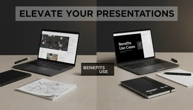
Benefits and Use Cases for Custom Google Slides Backgrounds
Custom Google Slides backgrounds provide significant advantages for professionals who regularly create presentations. The investment in developing quality background templates pays dividends through improved presentation consistency, reduced preparation time, and enhanced audience engagement.
Time efficiency represents one of the most immediate benefits of custom backgrounds. Once you've developed a library of branded background templates, creating new presentations becomes significantly faster. Instead of starting from scratch each time, you can focus on content development while maintaining visual consistency across all your presentations.
Brand differentiation helps your presentations stand out in competitive environments. Custom backgrounds that incorporate your brand elements, color schemes, and visual style create immediate recognition and reinforce your professional identity. This is particularly valuable for agencies and freelancers who need to distinguish themselves from competitors.
Client satisfaction improves when presentations reflect attention to detail and professional polish. Clients often judge presentation quality based on visual appearance before evaluating content quality. Custom backgrounds signal that you take pride in your work and understand the importance of professional presentation.
Expert Tip: Develop a small library of 3-5 background variations that work for different presentation types. This approach provides flexibility while maintaining consistency across your brand presentations.
Industry-Specific Applications
Web design agencies benefit from backgrounds that showcase their design capabilities while maintaining content focus. Subtle geometric patterns, clean gradients, or minimalist textures demonstrate design sophistication without overwhelming client information.
Digital marketing agencies often need backgrounds that can accommodate data visualizations, charts, and performance metrics. Clean, high-contrast backgrounds with designated zones for different content types work best for these applications.
Freelancers can use custom backgrounds to establish professional credibility and brand recognition. Consistent background use across proposals, client presentations, and project updates creates a cohesive professional image that builds trust and recognition.
Measuring Background Effectiveness
Effective backgrounds contribute to measurable presentation outcomes. Audience engagement often increases when presentations maintain visual interest without distraction. Information retention improves when backgrounds support rather than compete with content hierarchy. Brand recall strengthens when consistent visual elements appear across multiple presentations and touchpoints.
Track these metrics through presentation analytics, client feedback, and conversion rates for proposal presentations. Many professionals find that investing time in background development leads to improved client relationships and increased project success rates.
Common Mistakes and How to Avoid Them
Even experienced designers make predictable mistakes when creating Google Slides backgrounds. Understanding these pitfalls helps you avoid amateur-looking presentations and maintain professional standards across all your work.
Overwhelming complexity represents the most frequent background mistake. Many creators assume that more visual elements equal better design, leading to backgrounds that compete with content for attention. The most effective backgrounds often use restraint, providing visual interest through subtle elements rather than complex compositions.
Poor color contrast creates readability problems that can derail even the best content. This issue often occurs when designers prioritize aesthetics over functionality, choosing color combinations that look appealing but fail practical readability tests. Always test your backgrounds with actual text content under various lighting conditions.
Inconsistent application across slides within the same presentation creates a disjointed experience for your audience. While individual slides may benefit from background variations, these changes should follow logical patterns that support your content structure rather than random aesthetic choices.
Why It Matters: Consistency in background application helps your audience focus on content transitions rather than visual distractions. This focus improves information retention and presentation flow.
Resolution and Quality Issues
Low-Resolution Images become particularly problematic when presentations are displayed on large screens or high-resolution monitors. Images that look acceptable on computer screens often appear pixelated or blurry when projected, undermining your professional credibility.
File size problems can slow down presentation loading and sharing, particularly when working with clients who have limited bandwidth or older computer systems. Balance image quality with file size by optimizing images before upload and testing presentation performance across different devices.
Text Readability Failures
Insufficient contrast between background and text colors creates accessibility issues and reduces readability for all audiences. This problem often develops gradually as designers make incremental adjustments without testing the cumulative effect on text visibility.
Pattern interference occurs when background patterns create visual noise that makes text difficult to read. This issue is particularly common with geometric patterns, textured backgrounds, or busy photographic images used as backgrounds.
Best Practices for Google Slides Background Design
Professional background design follows established principles that ensure both aesthetic appeal and functional effectiveness. These best practices have been refined through years of presentation design experience and user testing across various industries and use cases.
Start with Content Planning before selecting or designing backgrounds. Understanding your presentation's content structure, key messages, and audience expectations helps inform background choices that support rather than compete with your objectives. This planning prevents the common mistake of choosing backgrounds based solely on aesthetic preferences.
Maintain brand alignment throughout your background design process. Every visual element should reinforce your brand identity and professional positioning. This alignment includes color choices, pattern styles, typography considerations, and overall aesthetic direction.
Test across devices to ensure your backgrounds work effectively on different screen sizes, resolutions, and viewing conditions. What looks perfect on your computer monitor might appear differently on projectors, tablets, or mobile devices where your audience might view your presentation.
Pro Tip: Create a simple testing checklist that includes viewing your backgrounds on different devices, under various lighting conditions, and with different content types. This systematic approach prevents last-minute surprises during important presentations.
Technical Optimization Guidelines
Image preparation should follow consistent standards to ensure reliable results across all your presentations. Use images with dimensions of 1920×1080 pixels or higher, save files in appropriate formats (PNG for graphics with transparency, JPEG for photographs), and optimize file sizes to balance quality with loading speed.
Color management requires attention to how colors appear across different display technologies. Colors that look vibrant on LED monitors might appear washed out on older projectors. Stick to color palettes that maintain their impact across various display technologies.
Version control becomes crucial when developing background templates for ongoing use. Maintain organized files with clear naming conventions, document design decisions for future reference, and create backup copies of successful background designs.
Content Integration Strategies
Text placement zones should be considered during background design. Create backgrounds with designated areas for headlines, body text, and visual elements. This planning ensures that your backgrounds support rather than interfere with content layout.
Visual weight balance requires careful consideration of how background elements interact with foreground content. Heavy background elements should be balanced by lighter content areas, while subtle backgrounds can support more prominent content elements.
Scalability planning ensures your backgrounds work effectively across different presentation lengths and content types. Develop background systems that can accommodate single slides, short presentations, and extended presentations without becoming visually repetitive or overwhelming.
Common Questions About Google Slides Backgrounds
How do I make my Google Slides background consistent across all slides?
Consistency across slides requires using the master slide feature effectively. Access the master slide editor through Slide > Edit master, then apply your background choices to the master slide. This approach ensures that all slides in your presentation inherit the same background formatting unless specifically overridden on individual slides.
For presentations that need slight variations, create multiple master slide layouts with related background designs. This technique allows you to maintain overall consistency while providing visual variety for different slide types like title slides, content slides, and closing slides.
Remember that individual slide background changes will override master slide settings. If you need to modify specific slides, document these changes to maintain consistency when updating or duplicating presentations in the future.
Can I use copyrighted images as Google Slides backgrounds?
Using copyrighted images without proper licensing creates legal risks that can be particularly problematic for agencies and freelancers working with clients. Copyright law applies to presentation backgrounds just as it does to other commercial uses of protected imagery.
Safe alternatives include using stock photography with appropriate licenses, creating original graphics, or using royalty-free image resources. Many stock photography services offer presentation-specific licenses that cover business use of images in client presentations.
When working with client-provided images, ensure they have the rights to use those images in presentations. Document image sources and licensing information for future reference, particularly for presentations that might be reused or modified over time.
What's the best way to ensure text readability over image backgrounds?
Text readability over image backgrounds requires a systematic approach to contrast management. The most effective technique involves adding semi-transparent overlay layers between the background image and text content. Dark overlays work well for light text, while light overlays support dark text.
Consider using text shadow effects or outline styling to improve text visibility without completely obscuring background images. These techniques allow you to maintain visual interest while ensuring content remains readable under various viewing conditions.
Test your text readability under different lighting conditions, including bright conference rooms and dimly lit presentation spaces. What appears readable on your computer screen might become illegible under bright overhead lighting or when projected onto less-than-ideal surfaces.
How can I create backgrounds that work for both digital and printed presentations?
Designing backgrounds that work across digital and print media requires understanding the different color reproduction capabilities of screens versus printed materials. Colors that appear vibrant on screens often look muted when printed, while high-contrast elements that work well in print might appear harsh on screens.
Use CMYK color profiles when designing backgrounds that will be printed, and test print samples before finalizing designs. Avoid using very light colors or subtle gradients that might not reproduce well in standard office printing environments.
Consider creating separate background versions optimized for each medium. This approach allows you to maximize the effectiveness of each presentation format while maintaining overall design consistency across your brand materials.
What file formats work best for Google Slides backgrounds?
PNG format works best for graphics with transparent elements, logos, or images that require sharp edges and clear details. This format maintains image quality while supporting transparency effects that can be useful for layered background designs.
JPEG format is ideal for photographic backgrounds where file size matters more than transparency support. JPEG compression can significantly reduce file sizes while maintaining acceptable image quality for most presentation contexts.
SVG format provides the best scalability for simple graphics and logos, maintaining crisp appearance at any size. However, complex SVG files might not display consistently across all devices and Google Slides versions.
Avoid using GIF format for backgrounds unless you specifically need animated elements, as this format's color limitations can reduce image quality compared to PNG or JPEG alternatives.
How do I optimize background loading times for large presentations?
Background loading optimization becomes crucial for presentations with many slides or when sharing presentations with clients who have limited bandwidth. Start by compressing images before upload, targeting file sizes under 1MB per background image while maintaining acceptable visual quality.
Reuse background elements across multiple slides rather than uploading unique images for each slide. This approach reduces total file size and improves loading consistency throughout your presentation.
Consider using solid colors or simple gradients for slides where complex backgrounds don't add significant value. These background types load instantly and can provide visual relief in longer presentations while maintaining professional appearance.
Test your presentation loading times on different internet connections and devices to ensure acceptable performance for your intended audience and sharing methods.
The Bottom Line
Creating effective Google Slides backgrounds combines technical understanding with design principles to produce presentations that engage audiences while maintaining professional credibility. The key lies in balancing visual interest with content readability, ensuring your backgrounds enhance rather than compete with your message. Whether you're developing templates for ongoing client work or creating one-off presentations, investing time in background design pays dividends through improved audience engagement and professional positioning. Get started with Dope Theme to explore professional presentation templates and design resources that can elevate your next project. Ready to get started? Visit Dope Theme to learn more.