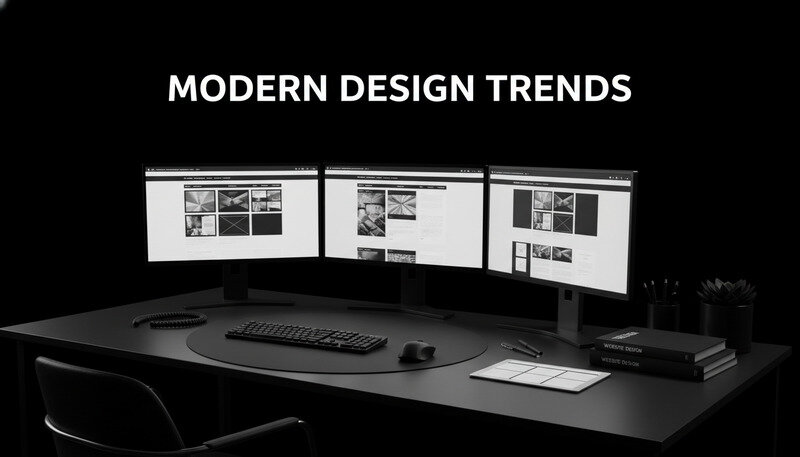
Building an effective website requires more than just throwing together some pages and calling it done. Modern website design has evolved into a sophisticated discipline that balances user experience, visual appeal, and business objectives. Whether you're a web design agency crafting sites for clients, a freelancer building your portfolio, or a digital agency looking to stay competitive, understanding current design trends can make the difference between a site that converts and one that gets ignored.
The landscape of website design continues to shift rapidly, driven by changing user expectations, new technologies, and evolving search engine algorithms. What worked five years ago might actually hurt your site's performance today. From minimalist layouts that load lightning-fast to interactive elements that keep visitors engaged, the best website design approaches focus on creating meaningful connections between brands and their audiences.
1. Minimalist Design with Maximum Impact
Minimalist website design isn't about having less content—it's about presenting your content more effectively. This approach strips away unnecessary elements, focusing user attention on what truly matters: your message, products, or services.
The Psychology Behind Minimalism
Users process visual information incredibly quickly, making decisions about your site within milliseconds. A cluttered interface creates cognitive overload, forcing visitors to work harder to find what they need. Minimalist design reduces this mental burden by providing clear visual hierarchy and plenty of white space.
Why It Matters: Studies show that users form opinions about website credibility within 50 milliseconds of viewing a page. Clean, minimalist designs consistently score higher in trust and usability metrics.
Key Elements of Effective Minimalist Design
- Strategic White Space: Empty space isn't wasted space—it guides the eye and creates breathing room around important elements
- Limited Color Palette: Typically 2-3 primary colors that align with brand identity and create visual consistency
- Typography Focus: Clean, readable fonts that serve both aesthetic and functional purposes
- Purposeful Content: Every element serves a specific function, eliminating decorative clutter that doesn't add value
Implementation Best Practices
The most successful minimalist designs start with content strategy. Before designing anything, identify your core message and the primary action you want visitors to take. Then build your design around supporting that goal.
Consider how major tech companies like Apple and Google implement minimalism. Their homepages feature vast amounts of white space, minimal navigation options, and clear calls-to-action. This isn't accidental—it's a deliberate strategy to reduce friction in the user journey.
Common Minimalist Design Mistakes
Many designers confuse minimalism with simply removing elements. True minimalist design requires careful consideration of what to keep, not just what to remove. Each remaining element must work harder to communicate meaning and guide user behavior.
| Element | Minimalist Approach | Common Mistake |
|---|---|---|
| Navigation | 5-7 clear menu items | Hiding essential navigation in hamburger menus |
| Content | Focused messaging with clear hierarchy | Removing important information entirely |
| Imagery | High-quality, purposeful visuals | Using generic stock photos as filler |
| Colors | 2-3 brand-aligned colors | Defaulting to black and white only |
2. Dark Mode and Adaptive Themes
Dark mode has evolved from a niche preference to a mainstream expectation. Originally popularized by developers working long hours, dark interfaces now appeal to users across all demographics, offering both aesthetic appeal and practical benefits.
Technical Advantages of Dark Mode
Dark themes reduce eye strain in low-light environments and can significantly improve battery life on OLED screens. For users spending hours browsing websites, this translates to a more comfortable experience and longer device usage between charges.
The implementation of dark mode requires more than simply inverting colors. Effective dark themes use carefully selected color palettes that maintain readability while reducing overall screen brightness. This involves choosing appropriate contrast ratios and ensuring text remains legible against darker backgrounds.
Adaptive Theme Implementation
Modern websites increasingly offer theme switching capabilities, allowing users to choose their preferred viewing experience. This personalization extends beyond simple dark/light modes to include options for high contrast, reduced motion, and font size adjustments.
Pro Tip: Implement system-preference detection using CSS media queries. This automatically applies the user's device-level theme preference without requiring manual selection.
Design Considerations for Dark Themes
- Color Contrast: Maintain WCAG accessibility standards with sufficient contrast between text and background elements
- Brand Consistency: Adapt brand colors to work effectively in both light and dark environments
- Image Optimization: Ensure photos and graphics remain visually appealing against darker backgrounds
- Interactive Elements: Design buttons, forms, and navigation that remain intuitive in dark mode
User Experience Benefits
Dark mode isn't just about aesthetics—it can improve user engagement and reduce bounce rates. Users often associate dark interfaces with premium, modern experiences. When implemented thoughtfully, dark themes can reinforce brand positioning and create memorable visual experiences.
The key lies in offering choice rather than forcing a single theme. Users who prefer light interfaces shouldn't be penalized, and the switching mechanism should be intuitive and easily accessible.
3. Micro-Interactions and Subtle Animations
Micro-interactions are small, functional animations that provide feedback, guide user behavior, and add personality to digital experiences. These subtle movements bridge the gap between user actions and system responses, creating more intuitive and engaging interfaces.
The Science of Micro-Interactions
Human brains are wired to notice movement and change. Well-designed micro-interactions tap into this natural tendency, drawing attention to important elements and confirming user actions. This reduces uncertainty and builds confidence in the interface.
Research from user experience design studies shows that appropriate feedback mechanisms can improve task completion rates by up to 25%. Users feel more in control when they receive immediate visual confirmation of their actions.
Types of Effective Micro-Interactions
- Hover Effects: Subtle color changes or scaling when users mouse over buttons or links
- Form Validation: Real-time feedback showing field completion status or error states
- Loading Indicators: Progress bars or spinners that keep users informed during wait times
- Navigation Transitions: Smooth animations between page sections or menu states
- Button Feedback: Visual confirmation when buttons are clicked or tapped
Implementation Guidelines
The best micro-interactions feel natural and enhance functionality rather than distracting from it. They should have clear purposes: providing feedback, revealing functionality, or guiding attention to important elements.
Key Takeaway: Micro-interactions should be fast (typically 200-500 milliseconds), purposeful, and consistent throughout the site. Overdoing animations can slow performance and annoy users.
Performance Considerations
While micro-interactions enhance user experience, they must be implemented efficiently to avoid impacting site performance. CSS animations generally perform better than JavaScript-based effects, especially for simple transformations like scaling, rotation, or color changes.
Consider users with motion sensitivity by providing options to reduce or disable animations. The prefers-reduced-motion CSS media query allows you to respect user preferences and maintain accessibility standards.
4. Typography-Driven Design
Typography has emerged as a primary design element, moving beyond simple text display to become a central component of visual identity and user experience. Modern website design increasingly relies on typography to create hierarchy, establish mood, and guide user attention.
The Power of Font Psychology
Different typefaces evoke different emotional responses and associations. Serif fonts often convey tradition and reliability, while sans-serif fonts feel modern and approachable. Script fonts suggest elegance or creativity, and display fonts can communicate playfulness or boldness.
Understanding these associations allows designers to align typography choices with brand personality and user expectations. A law firm's website benefits from traditional, trustworthy fonts, while a creative agency might choose more experimental typefaces to showcase innovation.
Creating Typographic Hierarchy
Effective typography creates clear information hierarchy through size, weight, color, and spacing variations. This hierarchy guides users through content in a logical sequence, highlighting important information and making complex content more digestible.
| Typography Level | Purpose | Implementation |
|---|---|---|
| Headline (H1) | Primary page focus | 32-48px, bold weight, high contrast |
| Subheadings (H2-H3) | Section organization | 24-32px, medium weight, brand color |
| Body Text | Main content | 16-18px, regular weight, high readability |
| Captions | Supporting information | 14-16px, lighter weight or color |
Web Font Performance Optimization
Custom fonts can significantly impact page loading times if not implemented properly. Modern font loading strategies include font display properties, preloading critical fonts, and using font subsetting to reduce file sizes.
Expert Tip: Use
font-display: swapto ensure text remains visible during font downloads, preventing invisible text periods that frustrate users and hurt search rankings.
Responsive Typography
Typography must adapt seamlessly across different screen sizes and devices. This involves more than simply scaling font sizes—it requires considering reading distance, screen resolution, and user context.
Implement fluid typography using viewport units and CSS clamp functions to create smooth scaling between breakpoints. This ensures optimal readability whether users access your site on smartphones, tablets, or desktop computers.
Accessibility in Typography
Typography choices directly impact accessibility for users with visual impairments or reading difficulties. Maintain sufficient color contrast, choose legible fonts, and provide adequate line spacing to ensure content remains accessible to all users.
Consider offering font size controls or high-contrast modes for users who need additional assistance. These features demonstrate commitment to inclusive design and can improve user satisfaction across diverse audiences.
5. Immersive Storytelling with Parallax
Parallax scrolling creates depth and movement by making background elements move slower than foreground content as users scroll. When used strategically, this technique transforms static websites into immersive storytelling experiences that captivate visitors and encourage deeper engagement.
The Narrative Potential of Parallax
Effective parallax design guides users through a story or journey, revealing information progressively as they scroll. This sequential revelation creates anticipation and maintains interest, making complex information more digestible and memorable.
Consider how parallax can support your content strategy. Product launches benefit from building anticipation through staged reveals. Company histories become more engaging when presented as visual journeys through time. Service explanations gain clarity when broken into digestible, visually distinct sections.
Technical Implementation Strategies
Modern parallax effects rely on CSS transforms and JavaScript scroll listeners to create smooth, performant animations. The key lies in optimizing these effects to maintain smooth scrolling across all devices, particularly on mobile where performance constraints are more significant.
- CSS-Only Parallax: Using
transform3dandperspectivefor simple background movements - Intersection Observer API: Efficiently triggering animations when elements enter the viewport
- RequestAnimationFrame: Smooth animation loops that sync with browser refresh rates
- Hardware Acceleration: Leveraging GPU processing for complex transformations
Balancing Impact with Usability
Parallax effects must enhance rather than hinder user experience. Excessive movement can cause motion sickness or distract from content consumption. The most effective implementations use subtle movements that add depth without overwhelming the interface.
Why It Matters: Studies show that users spend 70% more time on pages with well-implemented parallax effects, but poorly executed parallax can increase bounce rates by up to 40%.
Mobile Considerations
Parallax effects traditionally performed poorly on mobile devices due to processing limitations and iOS Safari restrictions. Modern implementation techniques address these challenges through progressive enhancement and device-specific optimizations.
Consider disabling complex parallax effects on low-powered devices while maintaining the core content experience. This ensures all users can access your information regardless of their device capabilities.
Accessibility and Parallax
Motion-based effects can trigger vestibular disorders in sensitive users. Implement respect for the prefers-reduced-motion media query to disable parallax animations for users who have indicated motion sensitivity in their system preferences.
Provide alternative navigation methods for users who prefer traditional scrolling or use assistive technologies. Parallax should enhance the experience for users who can enjoy it without creating barriers for those who cannot.
6. Custom Illustrations and Brand Graphics
Custom illustrations have become a powerful differentiator in website design, offering unique visual language that stock photography simply cannot match. These bespoke graphics communicate brand personality while solving specific communication challenges that generic images fail to address.
The Strategic Value of Custom Graphics
Custom illustrations serve multiple functions beyond aesthetic appeal. They can simplify complex concepts, maintain visual consistency across all brand touchpoints, and create memorable experiences that distinguish your brand from competitors using similar stock imagery.
Unlike photography, illustrations can be modified, updated, and adapted without licensing concerns or model releases. This flexibility proves invaluable for brands that need to iterate quickly or maintain long-term visual consistency across diverse marketing materials.
Illustration Styles and Brand Alignment
- Flat Design: Clean, simple shapes that communicate clearly without visual complexity
- Isometric Illustrations: Three-dimensional representations that explain processes or systems
- Hand-Drawn Style: Organic, approachable aesthetics that humanize digital experiences
- Geometric Patterns: Structured designs that convey precision and professionalism
- Character-Based: Mascots or personas that create emotional connections with users
Implementation Across Digital Touchpoints
Custom graphics work most effectively when implemented consistently across all digital touchpoints. This includes website headers, social media graphics, email templates, and marketing materials. Consistency reinforces brand recognition and creates cohesive user experiences.
Pro Tip: Develop a comprehensive style guide that documents color palettes, illustration styles, and usage guidelines. This ensures consistency even when multiple designers work on different projects.
Technical Optimization for Web
Custom illustrations must be optimized for web delivery without losing visual quality. This involves choosing appropriate file formats, implementing responsive sizing, and considering loading performance across different connection speeds.
SVG format works excellently for simple illustrations, offering infinite scalability and small file sizes. More complex artwork might require PNG or WebP formats with multiple resolution variants for different screen densities.
Working with Illustrators and Designers
Successful custom illustration projects require clear communication between stakeholders and creative professionals. Develop detailed briefs that outline brand personality, target audience, and specific communication goals for each illustration.
Consider the long-term relationship with illustration providers. Brands benefit from working with illustrators who understand their visual language and can maintain consistency across multiple projects over time.
7. Advanced Grid Systems and Asymmetrical Layouts
Traditional grid systems provided structure and consistency, but modern website design increasingly embraces asymmetrical layouts that create visual interest while maintaining functional organization. These advanced approaches balance creativity with usability, offering unique experiences that stand out in crowded digital landscapes.
Breaking the Grid Strategically
Asymmetrical design doesn't mean abandoning structure—it means using structure more creatively. Successful asymmetrical layouts establish their own internal logic, guiding users through content while creating memorable visual experiences.
The key lies in understanding when to break conventional patterns and when to maintain them. Navigation, forms, and critical user interface elements often benefit from traditional approaches, while content presentation areas offer more opportunities for creative layout experimentation.
CSS Grid and Modern Layout Capabilities
Modern CSS Grid and Flexbox capabilities enable complex layouts that were previously impossible or required extensive workarounds. These tools allow designers to create sophisticated arrangements that adapt fluidly across different screen sizes.
| Layout Technique | Best Use Case | Key Advantage |
|---|---|---|
| CSS Grid | Complex multi-column layouts | Precise control over both rows and columns |
| Flexbox | Component-level alignment | Excellent for centering and distributing space |
| CSS Subgrid | Nested grid alignment | Maintains grid consistency across components |
| Container Queries | Responsive components | Elements respond to container size, not viewport |
Visual Hierarchy in Asymmetrical Design
Asymmetrical layouts require careful attention to visual hierarchy to remain usable. Size, color, positioning, and white space work together to guide user attention through unconventional arrangements.
Key Insight: Asymmetrical designs often perform better in user testing when they include clear focal points and logical reading patterns, even when those patterns differ from traditional layouts.
Responsive Considerations
Asymmetrical layouts present unique challenges for responsive design. Elements that create visual interest on desktop might become confusing or unusable on mobile devices. Successful implementations often simplify to more conventional arrangements on smaller screens.
Consider how your asymmetrical elements will adapt across breakpoints. Some complex arrangements might require completely different layouts for mobile, while others can scale proportionally with minor adjustments.
Performance and Accessibility
Complex layouts can impact both performance and accessibility if not implemented thoughtfully. Ensure that your CSS remains efficient and that screen readers can navigate your content logically despite unconventional visual arrangements.
Use semantic HTML structure that makes sense linearly, then apply CSS positioning to create visual interest. This approach ensures that your content remains accessible while achieving desired aesthetic effects.
8. Voice User Interface Integration
Voice user interfaces represent the next frontier in website interaction, moving beyond traditional point-and-click navigation to more natural, conversational experiences. As voice recognition technology improves and smart speakers become ubiquitous, websites that integrate voice capabilities gain significant competitive advantages.
The Evolution of Voice Interaction
Voice interfaces have progressed from simple command recognition to sophisticated natural language processing. Modern voice UIs can understand context, handle complex queries, and provide personalized responses that feel genuinely conversational.
This evolution creates new opportunities for website engagement. Users can navigate content, search for information, or complete transactions using voice commands, making websites more accessible and convenient across diverse usage contexts.
Implementation Strategies
- Web Speech API: Browser-native voice recognition capabilities for direct website integration
- Voice Search Optimization: Content structure that supports voice query patterns
- Audio Feedback: Spoken responses that confirm actions or provide information
- Multimodal Interfaces: Combining voice with visual elements for comprehensive experiences
Content Optimization for Voice
Voice queries differ significantly from typed searches. Users tend to ask complete questions rather than using keyword fragments. This shift requires content strategies that address natural language patterns and conversational search intent.
Expert Tip: Optimize for question-based queries by structuring content around common user questions. FAQ sections and conversational content formats perform particularly well in voice search results.
Accessibility Benefits
Voice interfaces provide significant accessibility improvements for users with motor impairments, visual limitations, or situational constraints. Hands-free navigation enables website usage in contexts where traditional input methods are impractical or impossible.
Consider how voice capabilities can complement rather than replace traditional navigation methods. The most successful implementations offer multiple interaction pathways, allowing users to choose their preferred approach based on their needs and context.
Privacy and User Trust
Voice integration raises important privacy considerations that must be addressed transparently. Users need clear information about how voice data is processed, stored, and used. Building trust through transparent privacy practices becomes essential for voice feature adoption.
Implement voice features with privacy-by-design principles, processing voice data locally when possible and providing clear controls for users who prefer to disable voice capabilities.

9. Sustainable Web Design Practices
Environmental consciousness increasingly influences design decisions as awareness grows about the internet's carbon footprint. Sustainable web design practices reduce environmental impact while often improving performance, user experience, and operational costs.
The Environmental Impact of Digital
The internet consumes approximately 4% of global electricity, with websites contributing significantly through energy-intensive servers, data transmission, and device usage. Every design decision—from image optimization to server efficiency—impacts this environmental footprint.
Sustainable design principles align environmental responsibility with business objectives. Faster-loading, more efficient websites typically rank better in search results, convert more visitors, and cost less to operate.
Energy-Efficient Design Strategies
- Image Optimization: Compressed formats, appropriate sizing, and lazy loading reduce bandwidth consumption
- Minimal JavaScript: Lighter code libraries and efficient scripting reduce processing requirements
- Green Hosting: Renewable energy-powered servers and efficient data centers
- Content Delivery Networks: Geographically distributed content reduces transmission distances
Performance as Sustainability
Website performance optimization directly correlates with reduced energy consumption. Faster-loading sites require less processing power, consume less bandwidth, and keep devices active for shorter periods.
Why It Matters: A one-second improvement in page load time can reduce energy consumption by up to 15% across all user sessions, while simultaneously improving conversion rates and user satisfaction.
User Experience Benefits
Sustainable design practices typically enhance rather than compromise user experience. Optimized images load faster, efficient code runs smoother, and streamlined interfaces reduce cognitive load while consuming fewer resources.
Consider how sustainability messaging can become part of your brand story. Users increasingly prefer brands that demonstrate environmental responsibility, making sustainability both an operational and marketing advantage.
Measuring and Monitoring Impact
Implement tools to measure your website's environmental impact and track improvements over time. Website carbon calculators and performance monitoring tools help quantify the effects of sustainable design decisions.
Regular auditing ensures that sustainability remains a priority as websites evolve. New features and content additions should be evaluated for their environmental impact alongside their business value.
10. Personalization and Dynamic Content
Personalization transforms generic website experiences into tailored interactions that respond to individual user preferences, behaviors, and contexts. Modern personalization goes beyond simple name insertion to create genuinely relevant experiences that increase engagement and conversion rates.
Data-Driven Personalization Strategies
Effective personalization relies on collecting and analyzing user data to understand preferences and predict needs. This includes browsing history, geographic location, device type, referral source, and previous interaction patterns.
The challenge lies in balancing personalization depth with privacy concerns and implementation complexity. Start with basic personalization elements and gradually increase sophistication based on user response and available data.
Implementation Approaches
| Personalization Type | Data Required | Implementation Complexity |
|---|---|---|
| Geographic | IP location | Low – basic geo-targeting |
| Behavioral | Browsing history | Medium – tracking and analysis |
| Demographic | User profile data | Medium – registration required |
| Predictive | Machine learning models | High – advanced analytics |
Content Adaptation Techniques
- Dynamic Headlines: Adjusting messaging based on traffic source or user segment
- Personalized Recommendations: Suggesting relevant products, content, or services
- Adaptive Navigation: Highlighting sections most relevant to user interests
- Contextual CTAs: Changing calls-to-action based on user journey stage
- Localized Content: Adapting language, currency, and cultural references
Privacy-Conscious Implementation
Modern personalization must respect user privacy while delivering relevant experiences. This involves transparent data collection practices, clear opt-in mechanisms, and robust security measures to protect user information.
Key Takeaway: The most successful personalization strategies focus on providing value to users rather than simply collecting data. Users willingly share information when they receive clear benefits in return.
Testing and Optimization
Personalization effectiveness requires continuous testing and refinement. A/B testing different personalization approaches helps identify which strategies resonate most with specific user segments.
Monitor key metrics including engagement rates, conversion improvements, and user satisfaction scores to measure personalization impact. Not all personalization attempts improve outcomes—data-driven optimization ensures resources focus on effective strategies.
Technical Infrastructure Requirements
Sophisticated personalization requires robust technical infrastructure including user tracking systems, content management capabilities, and real-time processing power. Consider scalability requirements as personalization programs expand.
Cloud-based personalization platforms can provide advanced capabilities without requiring extensive internal development resources. Evaluate build-versus-buy decisions based on your organization's technical capabilities and personalization goals.
11. Advanced Loading States and Skeleton Screens
Loading states have evolved from simple spinners to sophisticated skeleton screens and progressive loading techniques that maintain user engagement during content retrieval. These advanced approaches reduce perceived loading times while providing better user experiences across varying connection speeds.
The Psychology of Loading Perception
Users perceive waiting time differently based on the feedback they receive during loading processes. Skeleton screens that show content structure create anticipation and reduce uncertainty, making wait times feel shorter than identical durations with generic loading indicators.
Research in human-computer interaction demonstrates that users tolerate longer actual loading times when provided with engaging, informative loading states that indicate progress and maintain visual continuity.
Skeleton Screen Implementation
Skeleton screens preview content layout using placeholder elements that match the structure and proportions of incoming content. This technique creates smooth transitions from loading to loaded states while providing immediate visual feedback.
- Content Structure Preview: Gray boxes that match text line lengths and image dimensions
- Progressive Loading: Revealing content sections as they become available rather than waiting for complete page loads
- Animated Placeholders: Subtle shimmer effects that indicate active loading processes
- Contextual Skeletons: Different skeleton designs for different content types or user contexts
Performance Optimization Strategies
Advanced loading states work most effectively when combined with performance optimization techniques that actually reduce loading times. This includes image optimization, code splitting, and strategic resource prioritization.
Pro Tip: Implement critical resource prioritization to load above-the-fold content first, allowing users to begin interacting with your site while additional content loads in the background.
Mobile-First Loading Design
Mobile users often experience slower connection speeds and more variable network conditions. Loading state design must account for these constraints while maintaining engaging experiences across all devices.
Consider how loading states adapt to different screen sizes and orientations. Skeleton screens that work well on desktop might require significant modifications for mobile contexts.
Error State Integration
Effective loading state design includes graceful error handling that maintains user confidence when loading fails. This involves clear error messaging, retry mechanisms, and alternative content options.
Design error states that feel consistent with your overall loading experience rather than jarring interruptions. Users should understand what went wrong and what actions they can take to resolve the issue.
12. Augmented Reality Web Experiences
Augmented reality integration brings immersive experiences directly to web browsers without requiring specialized apps or downloads. WebAR technology enables product visualization, interactive demonstrations, and engaging brand experiences that bridge digital and physical worlds.
WebAR Technology Capabilities
Modern web browsers increasingly support augmented reality features through WebXR APIs and advanced JavaScript libraries. These capabilities enable 3D model viewing, virtual product placement, and interactive AR experiences accessible through standard web browsers.
The technology has matured to support practical business applications including virtual try-ons, product customization, and spatial visualization. Users can preview furniture in their homes, test cosmetic products, or explore complex machinery through their web browsers.
Implementation Approaches
- Model Viewing: 3D product models that users can rotate, scale, and examine in detail
- Virtual Placement: AR features that place products in users' real environments using device cameras
- Interactive Demonstrations: Step-by-step tutorials or explanations enhanced with 3D visualization
- Brand Experiences: Immersive storytelling that combines physical and digital elements
User Experience Considerations
AR experiences must provide clear value while remaining intuitive for users unfamiliar with augmented reality technology. This involves designing obvious entry points, providing helpful instructions, and ensuring graceful fallbacks for unsupported devices.
Expert Tip: Start with simple AR features like 3D model viewing before implementing complex spatial tracking. Users need time to adapt to new interaction paradigms, and simpler implementations often provide better conversion results.
Technical Requirements and Limitations
WebAR requires significant processing power and specific device capabilities including cameras, motion sensors, and graphics processing. Consider how AR features will perform across different devices and connection speeds.
Implement progressive enhancement approaches that provide basic functionality for all users while offering enhanced AR experiences for capable devices. This ensures broad accessibility while showcasing cutting-edge capabilities.
Business Applications and ROI
AR integration can significantly impact business metrics including engagement rates, time on site, and conversion rates. Users who interact with AR features typically show higher purchase intent and lower return rates for applicable products.
Consider which aspects of your business benefit most from AR visualization. Fashion, furniture, automotive, and complex B2B products often see the strongest returns from AR investment.
Future-Proofing AR Implementation
AR technology continues evolving rapidly, with new capabilities and standards emerging regularly. Design AR features with flexibility to adapt to improving technology while maintaining current functionality.
Stay informed about WebXR standards development and browser support improvements. Early adoption of stable AR features can provide competitive advantages as the technology becomes mainstream.
Common Questions About Website Design
What makes a website design effective in today's digital landscape?
Effective website design balances multiple factors including user experience, visual appeal, technical performance, and business objectives. The most successful designs prioritize user needs while supporting brand goals through strategic layout, content organization, and interaction design.
Modern effectiveness requires mobile-first approaches, fast loading times, accessible design patterns, and clear conversion paths. Users expect websites to work seamlessly across devices while providing personalized, relevant experiences that respect their time and privacy.
Technical factors like search engine optimization, security implementation, and performance optimization increasingly influence design decisions. Effective designs integrate these considerations from the beginning rather than treating them as afterthoughts.
How do I choose the right design trends for my specific website?
Design trend selection should align with your brand identity, target audience preferences, and business objectives rather than following trends blindly. Consider your users' technical capabilities, industry expectations, and long-term brand strategy when evaluating new design approaches.
Start by analyzing your current website performance and identifying specific areas for improvement. If users struggle with navigation, focus on trends that improve usability. If engagement rates are low, consider interactive elements or personalization features.
Test trend implementations on small scale before full deployment. A/B testing different design approaches helps identify which trends actually improve user experience and business metrics for your specific audience and context.
What's the relationship between website design and search engine optimization?
Modern search engines evaluate numerous design-related factors when ranking websites, including page loading speed, mobile responsiveness, user engagement metrics, and content accessibility. Good design practices typically align with SEO requirements, creating mutually beneficial relationships.
User experience signals like bounce rate, time on page, and click-through rates directly influence search rankings. Websites that provide better user experiences through thoughtful design tend to perform better in search results.
Technical design decisions impact SEO through site architecture, URL structure, image optimization, and code efficiency. Clean, semantic HTML and efficient CSS support both user experience and search engine crawling.
How important is mobile responsiveness in current website design?
Mobile responsiveness is essential rather than optional in current website design. Over 60% of web traffic comes from mobile devices, and search engines prioritize mobile-friendly sites in their ranking algorithms.
Responsive design goes beyond simple scaling to consider touch interfaces, varying screen sizes, different usage contexts, and mobile-specific user behaviors. Successful mobile experiences often require different interaction patterns and content prioritization compared to desktop versions.
Consider mobile-first design approaches that start with mobile constraints and progressively enhance for larger screens. This methodology typically results in cleaner, more focused designs that work well across all devices.
What role does website loading speed play in design decisions?
Loading speed significantly impacts user experience, search engine rankings, and conversion rates. Every second of loading delay can reduce conversions by up to 7%, making performance optimization a critical design consideration.
Design decisions directly affect loading speed through image usage, animation complexity, font choices, and code efficiency. Balancing visual appeal with performance requires strategic choices about which elements provide the most value for their performance cost.
Implement performance budgets that set limits on resource usage for different page types. This helps maintain speed standards while allowing creative flexibility within defined constraints.
How do I ensure my website design remains accessible to all users?
Accessibility should be integrated into design processes from the beginning rather than added afterward. This includes considering users with visual, auditory, motor, and cognitive impairments when making design decisions.
Follow established accessibility guidelines like WCAG 2.1 standards, which provide specific criteria for color contrast, keyboard navigation, screen reader compatibility, and alternative text implementation. These standards benefit all users, not just those with specific accessibility needs.
Test your designs with actual assistive technologies and diverse user groups when possible. Automated accessibility testing tools help identify technical issues, but human testing reveals real-world usability challenges that automated tools might miss.
Conclusion
Website design continues evolving as technology advances and user expectations shift, but the fundamental goal remains constant: creating meaningful connections between brands and their audiences through thoughtful, user-centered experiences. The trends explored here represent current best practices that balance innovation with usability, aesthetics with performance, and creativity with accessibility. Whether you're implementing minimalist layouts, exploring AR integration, or optimizing for voice interfaces, success comes from understanding your users' needs and choosing design approaches that genuinely serve those needs. Get started with Dope Theme to explore how these design trends can transform your next website project. Ready to get started? Visit Dope Theme to learn more.