Responsive design is a lot easier than you might think. Forget the old days of building separate mobile sites and desktop versions. You can handle it all with flexible layouts and smart CSS, usually in just a few key steps using modern techniques.
Whether you’re a web design agency managing multiple client projects or a freelancer building your first responsive theme, getting responsive design right matters. Content Strategy Your users expect websites that work flawlessly on their phones, tablets, and desktops. Search engines reward mobile-friendly sites with better rankings. And clients increasingly demand responsive solutions that reach users wherever they are.
This guide walks you through everything you need to master responsive design today. You’ll learn the core principles that make layouts flexible, discover the essential techniques that professional developers rely on, and get practical strategies for implementing responsive design in your next project. By the end, you’ll have a complete framework for building websites that look great and function perfectly on any device.
Understanding Responsive Design Fundamentals
Responsive design is a web development approach that creates dynamic changes to the appearance of a website, depending on the screen size and orientation of the device being used to view it. Think of it as building one website that automatically adapts to provide an optimal viewing experience across all devices.
The concept emerged from the need to address the explosive growth of mobile internet usage. Rather than maintaining separate mobile and desktop sites, responsive design uses flexible layouts, images, and cascading style sheet media queries to create a single solution that works everywhere.
The Core Philosophy Behind Responsive Design
At its heart, responsive design follows three fundamental principles. First, it uses fluid grids that scale proportionally rather than fixed-width layouts. Second, it employs flexible images and media that resize within their containing elements. Third, it leverages media queries to apply different CSS styles based on device characteristics.
Why It Matters: A responsive approach means you maintain one codebase instead of multiple versions, reducing development time and ongoing maintenance costs while ensuring consistent user experiences.
This philosophy represents a shift from the traditional desktop-first mentality to a more inclusive approach that considers all screen sizes as equally important. When you build responsively, you’re creating websites that work for everyone, regardless of their device choice.
Key Components That Make Websites Responsive
Understanding the building blocks of responsive design helps you implement it effectively. The viewport meta tag tells browsers how to control the page’s dimensions and scaling. Flexible grid systems use relative units like percentages instead of fixed pixels. CSS media queries detect screen characteristics and apply appropriate styles.
Responsive images adapt to different screen sizes and resolutions, often using the srcset attribute or CSS techniques. Typography scales appropriately, maintaining readability across devices. Navigation systems transform to accommodate touch interfaces and smaller screens.
Comparison of Responsive Design Approaches
| Approach | Best For | Advantages | Considerations |
|---|---|---|---|
| Mobile-First | New projects, content-heavy sites | Progressive enhancement, better performance | Requires rethinking desktop layouts |
| Desktop-First | Existing sites, complex layouts | Easier transition from fixed designs | May lead to bloated mobile experiences |
| Content-First | Editorial sites, blogs | Optimal content presentation | Requires deep content analysis |
Each approach has its place in responsive design. Mobile-first design starts with the smallest screen and progressively enhances for larger displays. Desktop-first begins with full-featured layouts and adapts downward. Content-first prioritizes information hierarchy regardless of device.
The mobile-first approach has gained popularity because it forces designers to focus on essential content and functionality. When you start with constraints, you naturally create cleaner, more focused experiences that work well when enhanced for larger screens.
How Responsive Design Works in Practice
Responsive design operates through a combination of flexible layouts, scalable images, and conditional styling. The process begins with establishing a fluid foundation using relative units and flexible containers, then applies device-specific adjustments through media queries.
The browser plays a crucial role in this process. When a user visits your responsive site, the browser evaluates the viewport size and device characteristics, then applies the appropriate CSS rules to render the optimal layout for that specific context.
The Viewport and Its Critical Role
The viewport meta tag serves as the foundation for responsive behavior. Without it, mobile browsers assume your site was designed for desktop and scale it down, creating tiny, unusable text and interface elements.
<meta name="viewport" content="width=device-width, initial-scale=1.0">
This simple line tells the browser to match the screen’s width in device-independent pixels and set the initial zoom level to 100%. It’s the first step in making any website responsive and should be included in every HTML document head.
Pro Tip: Always include the viewport meta tag before any CSS links in your HTML head. This ensures proper rendering before styles are applied.
The viewport concept extends beyond just the meta tag. CSS viewport units like vw (viewport width) and vh (viewport height) allow elements to size themselves relative to the browser window, creating truly flexible layouts that adapt to any screen size.
Flexible Grid Systems and Layout Techniques
Modern responsive design relies heavily on CSS Grid and Flexbox for creating flexible layouts. CSS Grid excels at two-dimensional layouts where you need precise control over rows and columns. Flexbox works best for one-dimensional layouts and component-level flexibility.
CSS Grid allows you to define responsive layouts using fractional units (fr) that automatically distribute available space. A three-column layout might use grid-template-columns: 1fr 2fr 1fr, creating a flexible structure that maintains proportions across screen sizes.
Flexbox provides powerful alignment and distribution capabilities. Container properties like justify-content and align-items control how child elements position themselves within available space. Flex items can grow, shrink, and wrap as needed.
Media Queries: The Responsive Control System
Media queries act as the conditional logic of responsive design. They detect device characteristics like screen width, height, orientation, and resolution, then apply appropriate CSS rules based on those conditions.
-
Basic Media Query Structure: Media queries use the
@mediarule followed by conditions and CSS declarations - Breakpoint Strategy: Define specific screen widths where your layout needs to change
- Mobile-First Implementation: Start with base mobile styles, then enhance for larger screens
- Testing and Refinement: Use browser developer tools to test breakpoints and adjust as needed
Common breakpoints include 480px for small phones, 768px for tablets, 1024px for small desktops, and 1200px for large screens. However, your content should dictate breakpoints rather than device categories.
Progressive Enhancement Through Responsive Layers
Responsive design works best when implemented as progressive enhancement. Start with a solid mobile foundation that delivers core functionality and content to all users. Then layer on enhancements for larger screens and more capable devices.
This approach ensures your website works for everyone while providing richer experiences where possible. Users on slower connections or older devices still get full access to your content, while those with modern browsers and fast connections enjoy enhanced features.
Key Takeaway: Progressive enhancement creates more resilient websites that degrade gracefully when faced with technical limitations or unexpected browsing conditions.
Essential Responsive Design Components
Building effective responsive websites requires mastering several key components that work together to create flexible, adaptive layouts. Each component serves a specific purpose in the responsive ecosystem, and understanding how they interact helps you build better websites.
Professional web designers and developers at agencies like Dope Theme focus on these core components because they form the foundation of every successful responsive project. Getting these elements right from the start saves time and prevents costly redesigns later.
Fluid Typography and Scalable Text
Typography in responsive design goes beyond simply making text readable on small screens. It involves creating hierarchical systems that maintain their relationships across all device sizes while optimizing readability and visual impact.
Relative units like em, rem, and viewport units (vw, vh) allow text to scale proportionally with screen size. The rem unit, based on the root element’s font size, provides consistent scaling across your entire site. Viewport units enable text that grows and shrinks with the browser window.
CSS clamp() function offers precise control over responsive typography by setting minimum, preferred, and maximum values. font-size: clamp(1rem, 4vw, 2rem) ensures text never gets smaller than 1rem or larger than 2rem while scaling at 4% of viewport width.
Expert Tip: Establish a modular scale for your typography system. Use ratios like 1.25 (major third) or 1.618 (golden ratio) to create harmonious size relationships that work across all screen sizes.
Line height, letter spacing, and paragraph margins also need responsive consideration. What works for desktop reading often needs adjustment for mobile consumption. Shorter line lengths on mobile require different spacing ratios to maintain readability.
Flexible Images and Media Handling
Images present unique challenges in responsive design because they have fixed dimensions but need to adapt to flexible containers. The basic responsive image technique uses max-width: 100% and height: auto to prevent images from overflowing their containers.
Modern responsive images go further with the srcset attribute and sizes attribute, allowing browsers to choose appropriate image files based on screen density and viewport size. This optimizes both visual quality and loading performance.
The HTML <picture> element provides even more control, enabling art direction where different image crops or compositions work better at different screen sizes. A wide landscape photo might work well on desktop but need a cropped square version for mobile display.
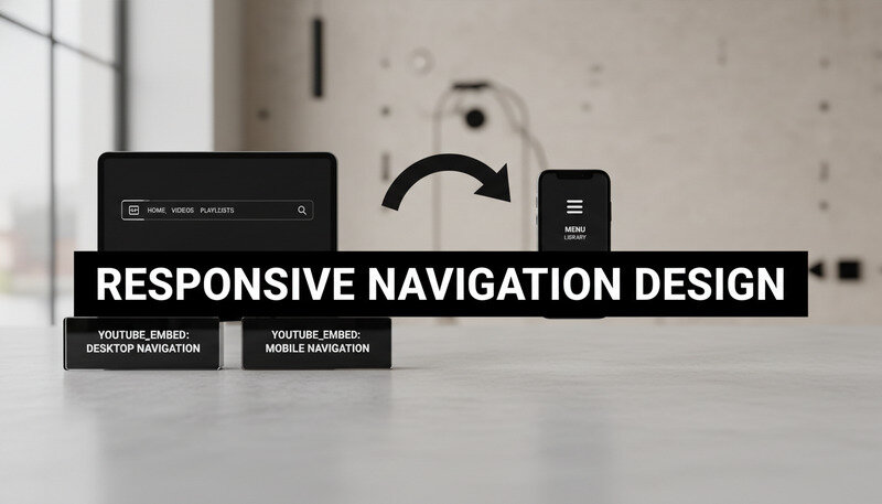
Navigation Patterns for Multiple Screen Sizes
Navigation systems must transform dramatically between desktop and mobile contexts. Desktop navigation can display multiple levels and numerous options simultaneously. Mobile navigation needs to conserve screen space while maintaining accessibility.
Popular mobile navigation patterns include:
- Hamburger Menu: Hides navigation behind an icon, revealing options when tapped
- Tab Bar: Displays primary navigation options as persistent tabs at screen bottom
- Priority Navigation: Shows important items inline, hiding secondary options in a menu
- Off-Canvas: Slides navigation in from the side, overlaying or pushing main content
Each pattern has specific use cases and implementation requirements. The hamburger menu works well for sites with many navigation options but can reduce discoverability. Tab bars excel for apps with 3-5 primary sections but don’t scale to complex hierarchies.
Responsive Forms and User Input
Forms require special attention in responsive design because they involve user interaction across different input methods. Touch screens, keyboards, and mouse interactions each have different requirements and constraints.
Form fields need adequate touch targets on mobile devices. Apple’s Human Interface Guidelines recommend minimum 44px touch targets, while Material Design suggests 48dp. Spacing between interactive elements prevents accidental taps.
Input types like email, tel, and url trigger appropriate virtual keyboards on mobile devices, improving user experience. Placeholder text, labels, and error messages need responsive consideration to remain readable and helpful across screen sizes.
Multi-step forms often benefit from different layouts on mobile versus desktop. Vertical stacking works better on narrow screens, while desktop layouts can utilize horizontal space more effectively.
Benefits and Real-World Use Cases
Responsive design delivers measurable benefits across multiple dimensions of web development and business success. From technical advantages like improved search engine optimization to practical benefits like reduced maintenance overhead, responsive approaches create value for developers, clients, and end users.
The business case for responsive design has strengthened as mobile internet usage continues growing. Recent studies show that over 58% of global web traffic comes from mobile devices, making responsive design essential rather than optional for most websites.
Technical and Performance Advantages
Responsive design consolidates your web presence into a single, maintainable codebase. Instead of managing separate mobile and desktop sites, you maintain one responsive site that adapts to all devices. This reduces development time, simplifies content management, and eliminates synchronization issues between multiple versions.
Search engines favor responsive websites because they provide consistent content and URLs across devices. Google specifically recommends responsive design as the preferred mobile configuration, and mobile-friendly sites receive ranking boosts in search results.
Performance benefits emerge from optimized resource loading and reduced server complexity. Responsive sites can implement progressive enhancement strategies that load essential content first, then enhance the experience based on device capabilities and connection speed.
Key Insight: Companies implementing responsive design typically see 10-15% improvements in search engine rankings and 20-30% increases in mobile conversion rates within six months of launch.
Business Impact and User Experience Benefits
Responsive design directly impacts business metrics through improved user engagement and conversion rates. Users who can easily navigate and interact with your site regardless of device are more likely to complete desired actions like purchases, sign-ups, or contact form submissions.
Maintenance costs decrease significantly with responsive design. Updates, content changes, and feature additions happen once rather than across multiple site versions. This efficiency allows teams to focus resources on improving functionality rather than managing multiple codebases.
Brand consistency improves when users encounter the same design language and functionality across all touchpoints. This unified experience strengthens brand recognition and user trust, particularly important for businesses with diverse audiences accessing content from various devices.
Industry-Specific Applications
E-commerce sites benefit enormously from responsive design because shopping behaviors vary significantly between devices. Users might research products on mobile during commutes, then complete purchases on desktop at home. Responsive design ensures seamless transitions between these contexts.
Content publishers and news organizations see improved engagement metrics with responsive implementations. Articles that are easy to read on phones during commutes and tablets during leisure time reach broader audiences and generate more page views.
Corporate websites use responsive design to accommodate diverse stakeholder needs. Investors might access annual reports on desktop computers, while job seekers browse career pages on mobile devices. Responsive design ensures all audiences receive optimal experiences.
Cost-Effectiveness and Resource Optimization
The financial advantages of responsive design compound over time. Initial development costs are typically 20-30% lower than building separate mobile and desktop sites. Ongoing maintenance costs decrease by 40-50% because changes only need implementation once.
Resource allocation becomes more efficient when teams focus on a single responsive codebase. Designers, developers, and content creators can collaborate more effectively without coordinating across multiple platforms. This streamlined workflow improves project timelines and reduces communication overhead.
Pro Tip: Calculate the total cost of ownership when evaluating responsive design. Include development, maintenance, hosting, and opportunity costs to see the full financial picture.
Common Responsive Design Mistakes and Solutions
Even experienced developers encounter challenges when implementing responsive design. Understanding common pitfalls and their solutions helps you avoid costly mistakes and deliver better results for clients and users.
Many responsive design problems stem from desktop-first thinking or incomplete understanding of how different devices handle web content. These issues become apparent during testing and can require significant rework if not addressed early in the development process.
Breakpoint Strategy Mistakes
One of the most frequent mistakes involves choosing breakpoints based on popular device sizes rather than content needs. Designing for specific devices like “iPhone” or “iPad” creates brittle layouts that break when new devices emerge or when users resize browser windows.
The solution involves content-driven breakpoint selection. Start with your smallest screen design and gradually increase viewport width until the layout feels cramped or unbalanced. That point becomes your first breakpoint. Continue this process for each larger screen size.
Image and Media Implementation Errors
Images frequently cause responsive design problems when developers rely solely on CSS scaling without considering performance implications. Large desktop images scaled down for mobile waste bandwidth and slow loading times, particularly problematic for users on cellular connections.
Proper responsive images require multiple image sizes and the srcset attribute to serve appropriate files based on screen size and pixel density. This approach optimizes both visual quality and loading performance across all devices.
Video and embedded media present similar challenges. Auto-playing videos that work on desktop can be disruptive on mobile devices. Embedded content like maps or social media widgets may not scale appropriately without specific responsive handling.
Navigation and User Interface Problems
Navigation systems often fail in responsive implementations when desktop patterns are simply hidden behind hamburger menus without considering mobile-specific user behaviors. Users on touch devices have different interaction patterns and expectations than desktop users with mouse and keyboard.
Effective mobile navigation requires rethinking information architecture, not just changing visual presentation. Priority-based navigation shows the most important options prominently while providing clear paths to secondary content.
Touch target sizing represents another frequent oversight. Interface elements that work well with precise mouse cursors may be too small or too close together for finger navigation. Minimum 44px touch targets with adequate spacing prevent user frustration.

Performance and Loading Issues
Responsive design can inadvertently hurt performance when implementations load desktop-sized resources for mobile users. Heavy JavaScript libraries, large image files, and complex CSS animations can make responsive sites slower than dedicated mobile versions.
Performance optimization requires mobile-first thinking throughout the development process. Start with essential functionality and lightweight resources, then progressively enhance for larger screens and faster connections.
Critical rendering path optimization becomes more important in responsive design because mobile devices often have slower processors and network connections. Above-the-fold content should load quickly while non-essential elements load asynchronously.
Testing and Quality Assurance Gaps
Many responsive design problems emerge from insufficient testing across real devices and network conditions. Browser developer tools provide useful approximations, but they can’t replicate actual device performance, touch interactions, or network limitations.
Comprehensive testing requires both emulated and real device testing. Use browser tools for initial development and layout verification, then test on actual phones, tablets, and desktop computers to identify real-world issues.
Network condition testing reveals performance problems that might not be apparent on fast development connections. Tools like Chrome DevTools’ network throttling simulate slower connections and help identify optimization opportunities.
Key Takeaway: Allocate 25-30% of your responsive design project timeline to testing and refinement. This investment prevents costly post-launch fixes and ensures better user experiences.
Best Practices for Responsive Implementation
Professional responsive design requires systematic approaches that ensure consistent quality across projects. These best practices emerge from years of real-world implementation experience and help teams deliver better results more efficiently.
Agencies and freelancers who master these practices can take on more complex projects with confidence, knowing their responsive implementations will work reliably across all devices and use cases.
Mobile-First Development Strategy
Mobile-first development starts with designing and coding for the smallest screens, then progressively enhancing for larger displays. This approach forces focus on essential content and functionality while creating more performant websites.
The technical implementation involves writing base CSS for mobile devices, then using min-width media queries to add enhancements for larger screens. This progressive enhancement approach ensures all users receive functional experiences while those with capable devices enjoy enhanced features.
Content strategy benefits from mobile-first thinking because it prioritizes the most important information and actions. When you design for limited screen space first, you naturally create clearer information hierarchies that work well across all device sizes.
Performance Optimization Techniques
Responsive websites must perform well across diverse network conditions and device capabilities. Performance optimization strategies include:
- Critical CSS: Inline essential styles to prevent render-blocking and speed up initial page display
- Lazy Loading: Load images and non-critical content as users scroll, reducing initial page weight
- Resource Prioritization: Load above-the-fold content first, then progressively load additional elements
- Compression: Use modern image formats like WebP and implement gzip compression for text resources
Image optimization deserves special attention in responsive design. Use appropriate formats, compress files without visible quality loss, and implement responsive images with srcset to serve optimal files for each device.
JavaScript performance becomes critical on mobile devices with limited processing power. Minimize JavaScript execution during page load, use efficient event handlers, and consider service workers for advanced performance optimization.
Accessibility and Inclusive Design
Responsive design must work for users with disabilities across all device types. This includes screen reader compatibility, keyboard navigation support, and adequate color contrast ratios that work in various lighting conditions.
Touch accessibility requires larger target sizes and adequate spacing between interactive elements. Users with motor impairments may have difficulty with precise touch interactions, making generous touch targets essential for inclusive design.
Visual accessibility considerations include scalable text that remains readable when users zoom to 200% magnification, color schemes that work for users with color vision deficiencies, and sufficient contrast ratios that work in bright sunlight or low-light conditions.
Pro Tip: Test your responsive designs with screen readers and keyboard navigation on both desktop and mobile devices. Many accessibility issues only become apparent through actual assistive technology testing.
Content Strategy for Multi-Device Experiences
Content presentation must adapt to different consumption patterns across devices. Mobile users often seek quick answers or specific information, while desktop users may engage with longer-form content or complex interactions.
Progressive disclosure techniques reveal information gradually based on user actions and screen real estate. This approach prevents overwhelming mobile users while providing comprehensive information for those who want it.
Microcopy and interface text become more critical in responsive design because screen space limitations make every word count. Clear, concise language helps users understand options and complete tasks efficiently.
Testing and Quality Assurance Workflows
Systematic testing prevents responsive design problems from reaching production. Effective testing workflows include:
- Emulator Testing: Use browser developer tools to test layouts across viewport sizes
- Real Device Testing: Test on actual phones, tablets, and desktop computers
- Network Condition Testing: Simulate slow connections to identify performance issues
- Accessibility Testing: Verify screen reader compatibility and keyboard navigation
- Cross-Browser Testing: Ensure consistent behavior across different browsers and versions
Automated testing tools can catch some responsive design issues, but manual testing remains essential for evaluating user experience quality. Create testing checklists that cover layout, functionality, performance, and accessibility across representative devices.
Documentation of testing results helps teams track issues and verify fixes. Include screenshots, device information, and specific reproduction steps for any problems discovered during testing.

Advanced Responsive Design Techniques
Modern responsive design extends beyond basic breakpoints and flexible layouts to include sophisticated techniques that create truly adaptive user experiences. These advanced approaches help professional developers build websites that not only look good across devices but also optimize functionality and performance for each context.
Understanding these techniques allows web design agencies and freelancers to offer more sophisticated solutions that stand out in competitive markets while delivering superior user experiences.
Container Queries and Element-Based Responsiveness
Container queries represent a significant evolution in responsive design, allowing elements to respond to their container’s size rather than the overall viewport. This approach enables more modular, reusable components that adapt based on their specific context within a layout.
Traditional media queries create global breakpoints that affect entire layouts. Container queries enable component-level responsiveness where a sidebar widget might have different layouts depending on whether it appears in a narrow sidebar or wide main content area.
The CSS Container Queries specification introduces the @container rule, similar to @media but based on containing element dimensions. This creates more flexible design systems where components can be used in various contexts without layout modifications.
Advanced Grid and Flexbox Patterns
CSS Grid and Flexbox offer sophisticated layout capabilities that go beyond basic responsive techniques. Advanced Grid patterns include:
- Auto-fit and Auto-fill: Create responsive grids that automatically adjust column count based on available space
- Grid Areas: Define named layout regions that can be repositioned across breakpoints
- Subgrid: Allow nested grids to align with parent grid lines for consistent layouts
- Intrinsic Web Design: Combine Grid, Flexbox, and modern CSS features for truly flexible layouts
Flexbox advanced patterns focus on component-level flexibility and alignment. Techniques like flex-basis calculations, flex-grow ratios, and flex-wrap strategies create sophisticated responsive behaviors within individual components.
Performance-First Responsive Strategies
Advanced responsive design prioritizes performance through strategic resource loading and optimization techniques. Critical resource prioritization ensures essential content loads first, while non-critical elements load progressively.
Resource hints like preload, prefetch, and preconnect optimize loading performance by informing browsers about upcoming resource needs. These techniques become more important in responsive contexts where different devices may need different resources.
Service workers enable advanced caching strategies that can dramatically improve perceived performance on repeat visits. They allow responsive sites to work offline and load instantly from cache while updating content in the background.
Key Insight: Advanced responsive sites often achieve 40-60% faster loading times through strategic performance optimization, leading to significantly higher user engagement and conversion rates.
Progressive Web App Integration
Progressive Web Apps (PWAs) represent the convergence of responsive design and native app capabilities. PWA techniques enhance responsive websites with features like offline functionality, push notifications, and home screen installation.
App shell architecture separates the basic user interface from dynamic content, enabling instant loading and offline functionality. This approach works particularly well with responsive design because the shell can adapt to different screen sizes while content loads asynchronously.
Web app manifests define how responsive sites behave when installed as apps on mobile devices. This includes icon sets for different screen densities, display modes, and orientation preferences that enhance the responsive experience.
Common Questions About Responsive Design
What’s the difference between responsive and adaptive design?
Responsive design uses flexible layouts that fluidly adjust to any screen size, while adaptive design creates specific layouts for predetermined screen sizes. Responsive design relies on CSS media queries, flexible grids, and scalable images to create one design that works everywhere. Adaptive design detects the user’s device and serves a specific layout designed for that screen size.
Responsive design is generally preferred because it works on any device, including future devices with new screen sizes. It also requires less maintenance since you’re working with one flexible design rather than multiple fixed layouts. Adaptive design can offer more control over specific device experiences but requires more development and maintenance effort.
The choice between responsive and adaptive often depends on project requirements and constraints. Responsive works best for most websites, while adaptive might be necessary for complex applications with very different desktop and mobile functionality requirements.
How do I choose the right breakpoints for my responsive design?
Choose breakpoints based on your content and design needs rather than specific device sizes. Start with your mobile design and gradually increase the viewport width until the layout feels cramped or unbalanced. That point becomes your first breakpoint where you’ll make layout adjustments.
Common breakpoint ranges include 480px for small phones, 768px for tablets, 1024px for small laptops, and 1200px for large screens. However, your specific content might require different breakpoints. Test your design by slowly resizing your browser window to identify natural breaking points.
Most websites work well with 3-4 breakpoints. Having too many breakpoints creates complex CSS that’s difficult to maintain. Focus on major layout changes rather than minor adjustments, and use flexible design elements that work across ranges rather than requiring constant tweaking.
Should I use CSS frameworks for responsive design?
CSS frameworks like Bootstrap, Foundation, or Tailwind CSS can speed up responsive development, especially for teams new to responsive techniques. They provide tested grid systems, component libraries, and responsive utilities that handle common use cases effectively.
Frameworks work well for projects with standard layouts and functionality. They’re particularly valuable for rapid prototyping, internal tools, or projects with tight deadlines. The trade-off is less design flexibility and potentially larger file sizes if you’re not using all framework features.
Custom responsive CSS gives you complete control over design and performance but requires more development time and expertise. Many professional teams use a hybrid approach, starting with framework concepts but customizing extensively for unique design requirements.
How do I handle responsive images effectively?
Modern responsive images require multiple techniques working together. Use the srcset attribute to provide different image sizes, allowing browsers to choose appropriate files based on screen size and pixel density. The sizes attribute tells browsers how much space the image will occupy at different viewport widths.
For art direction scenarios where different image crops work better at different sizes, use the <picture> element with multiple <source> elements. This allows you to show a wide landscape image on desktop but a cropped square version on mobile.
Performance optimization includes using modern formats like WebP when supported, implementing lazy loading for images below the fold, and ensuring all images have appropriate alt text for accessibility. Consider using a content delivery network (CDN) with automatic image optimization for the best performance.
What about responsive typography and text scaling?
Responsive typography goes beyond making text readable on small screens. Use relative units like rem for consistent scaling based on the root font size, and consider viewport units (vw, vh) for text that scales with screen size. The CSS clamp() function provides precise control by setting minimum, preferred, and maximum text sizes.
Line height, letter spacing, and paragraph margins need responsive consideration. Mobile reading patterns differ from desktop, often requiring different spacing ratios and line lengths for optimal readability. Shorter lines on mobile may need increased line height for comfortable reading.
Establish a typographic scale using consistent ratios like 1.25 or 1.618 to create harmonious size relationships across screen sizes. Test your typography on actual devices, as text rendering can vary significantly between desktop browsers and mobile devices.
How do I test responsive design effectively?
Effective responsive testing combines browser developer tools with real device testing. Start with browser tools for initial development and layout verification, then test on actual phones, tablets, and desktop computers to identify real-world issues that emulators might miss.
Create a testing checklist that covers layout, functionality, performance, and accessibility across representative devices. Include different browsers, operating systems, and network conditions in your testing matrix. Pay special attention to touch interactions, form usability, and loading performance on mobile devices.
Automated testing tools can catch some responsive issues, but manual testing remains essential for evaluating user experience quality. Document testing results with screenshots and specific reproduction steps for any problems discovered during testing.
What This Means for You
Responsive design has evolved from a nice-to-have feature to an essential requirement for modern websites. Whether you’re building themes for clients or developing your own web presence, mastering responsive techniques ensures your work reaches users effectively across all devices. Get started with Dope Theme to see how professional responsive design can transform your next project. Ready to get started? Visit Dope Theme to learn more.